Workflow Designer
Transformed how large organizations automate their business workflows with Dynamics 365 team.
OVERVIEW
Enterprise version of MS Dynamics 365 CRM provides customization features to create templates for 4 types of processes using respective ‘designers’ - Forms, Dashboard, Workflow, Business process flow. Most ‘designers’ were still a legacy format, and there was a lack of consistency in user experience across the designers. This project aimed to reimagine workflow designer based on certain agreed key design principles to be followed across all designers.
MY ROLE & DURATION
Lead Interaction Designer
Team: 1 Designer, 2 PM
Jun 2017 - Dec 2017
The Problem
Workflow is a type of CRM process used to automate tasks based on set triggers or conditions. A business analyst or a customizer creates a workflow that is as simple as sending an email when a new account is created or as complex as a series of custom actions executed based on conditional, branching, nested logic, sometimes with child usage workflows and custom steps.
A workflow process is the most used type, with an average of 15-20 custom workflows per org.
Based on the user research insights and customer feedback, we found that users were facing navigation and usability related difficulties in Workflow Designer.
My Role
I was involved from the inception stage and was the UX owner of this project. The project scope was divided into sprints.
I was participated in the initial workshops with PM, creating concepts, sketches, and wireframes, throughout design iterations. Post the design phase, I was also involved in the User testing, wherein I worked with the UX researcher to prepare a discussion guide. Insights from the Usability testing were incorporate before finalizing the design. This was followed by sharing design deliverables and supporting devs through the implementation phase. I conducted the UX reviews and participated in bug bashes before the final design sign-off.
Heuristic Evaluation
I invited 2 UX designers and 1 UX researcher to evaluate the existing workflow designer against the standard UX heuristics. We rated the need for improvement areas in the current product on a scale of 1-10.
.png)
This exercise helped me identify the critical areas of improvement -
- Aesthetic & minimalistic design
- Flexibility & efficiency of use
- User control & freedom
- Recognition rather than recall
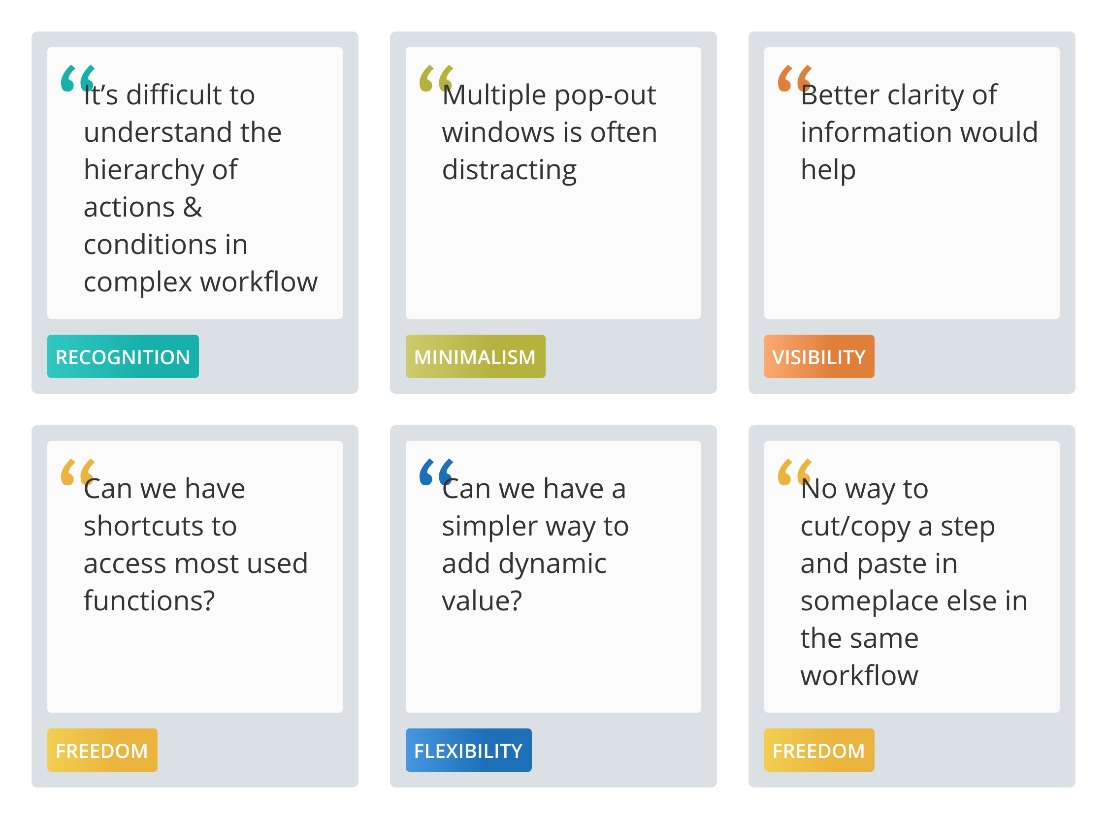
Understanding Users
The methodology used to understand users: Qualitative user interview and Customer feedback surveys
.png)
Common Use-cases
- John creates a new workflow and sets up triggers i.e., when the workflow will kick in.
- He defines workflow actions based on the required conditions.
- He sets up properties for each action.
- John enters dynamic value using slug editor.
- He manages the general workflow properties, audit history, and notes.
- Once the workflow is published and being used, he reviews the process session and checks for any error or failure.
Workflow example
.png)
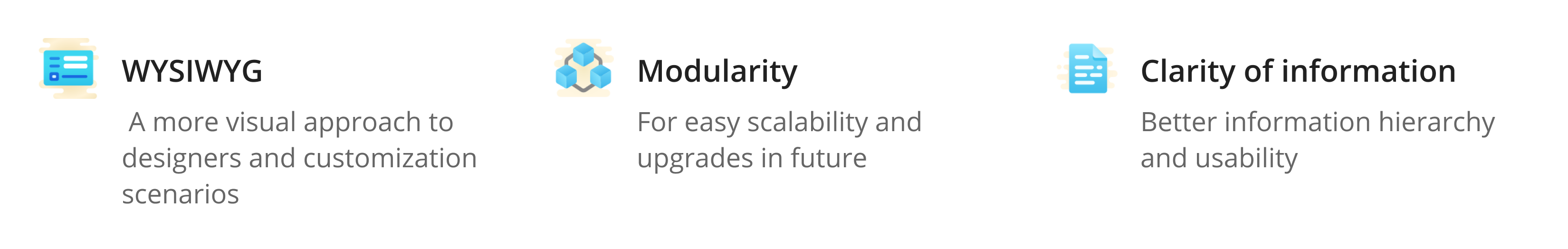
Product Goals
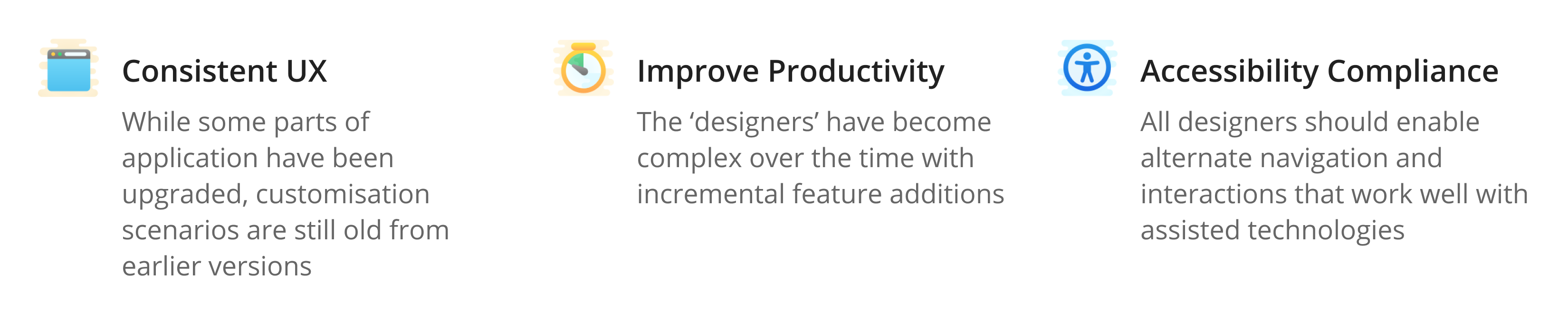
Design Goals
Constraints
- Strictly no infra changes were to be done
- Priority was to maintain parity with the older flow for a smooth upgrade
- To reduce or avoid steep learning curve for the users
Design Proposal
.png)
1. Introducing Canvas Space To Build Complex Workflows
The Challenge:
The user can build the workflow by adding a tile from components pane to the canvas area. Canvas had to accommodate the workflow structure and support complex scenarios such as:
- Tiles within multiple stages
- Different Tile types – Condition, action or custom tile
- Different Tile states – Selected, On-Focus, Error
- Tile to show property summary . This would help user get an overview w/o having to open each tile property separately
- Text-view of the workflow
- Nested condition groups
- Hint nodes wherever the user could add a new tile
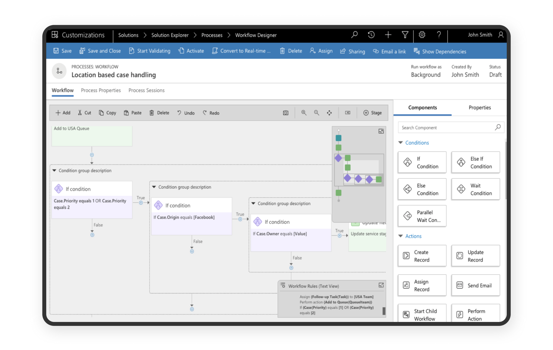
The Solution:
The App header was kept consistent to other new ‘designers’, which showed the basic properties provided by user while creating any new process. This freed up the real-estate for the canvas where users can build a workflow by adding or dragging a tile from the component panel.
I defined the workflow structure logic and designed the tiles that made sense for different types and states. The Hint node between each tile indicated where a new tile can be added by the user.
Nested groups were made easy to understand by adding borders around conditional groups. Each nested group had a description which helped set the context. To allow users simplify their view, each nested group could also be collapsed or expanded.
The Minimap element provided a quick overview and made navigation easier within a complex workflow.
2. Contextually Adding a New Tile
The Challenge:
Drag and drop function to perform an action is not the best accessibility practice.
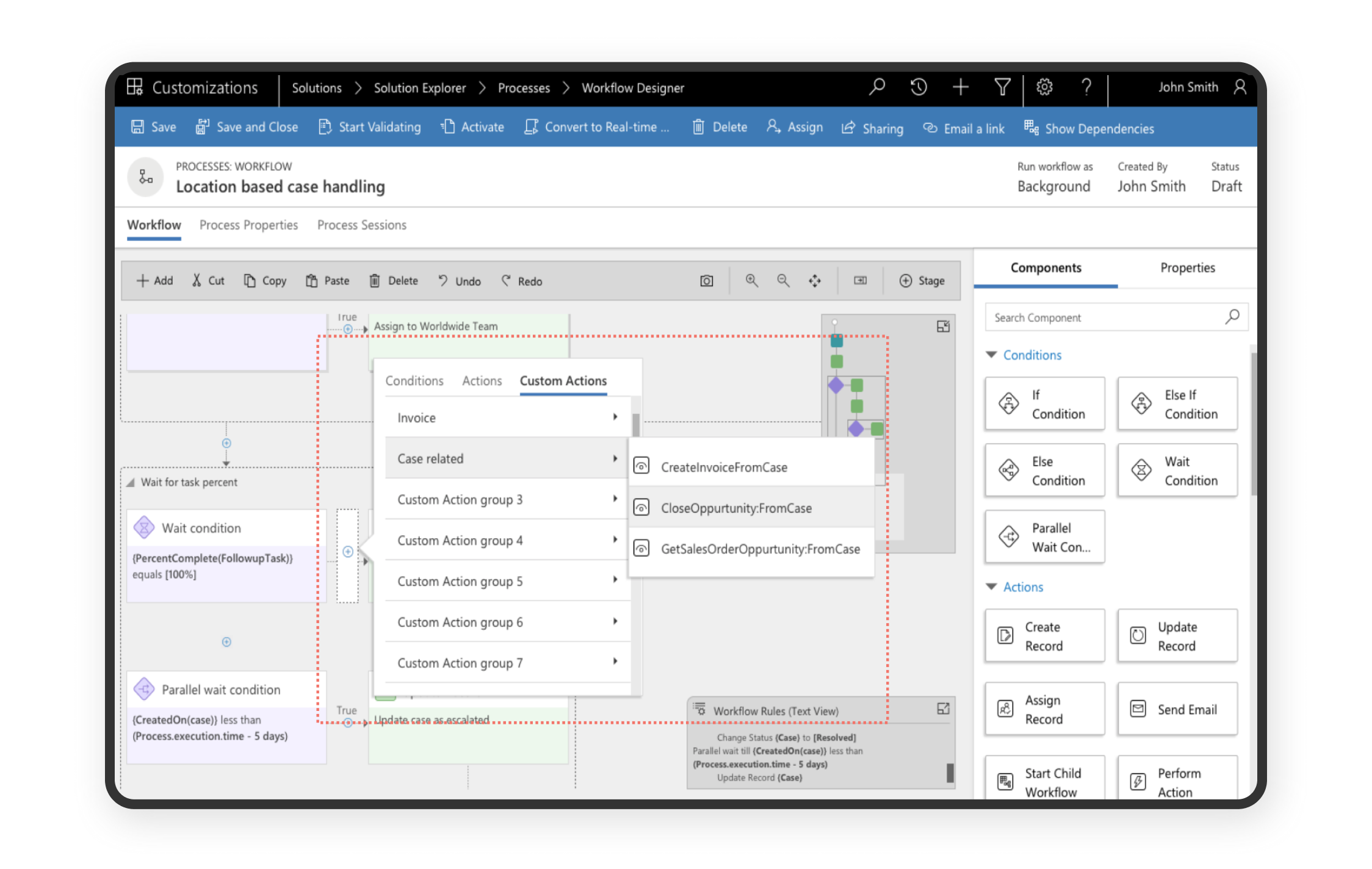
The Solution:
To provide an alternate, we added an inline fly-out that lets users choose the tile type to be added at the selected node. This came out to be the preferred method of adding tiles later from our user testing and user reviews.
3. Reducing Multiple Overlaying Pop-ups
The Challenge:
The existing flow relied on multiple pop-ups when user is trying to configure a step. This was distracting and often the context was lost as users were seeing multiple screens leading to high cognitive load.
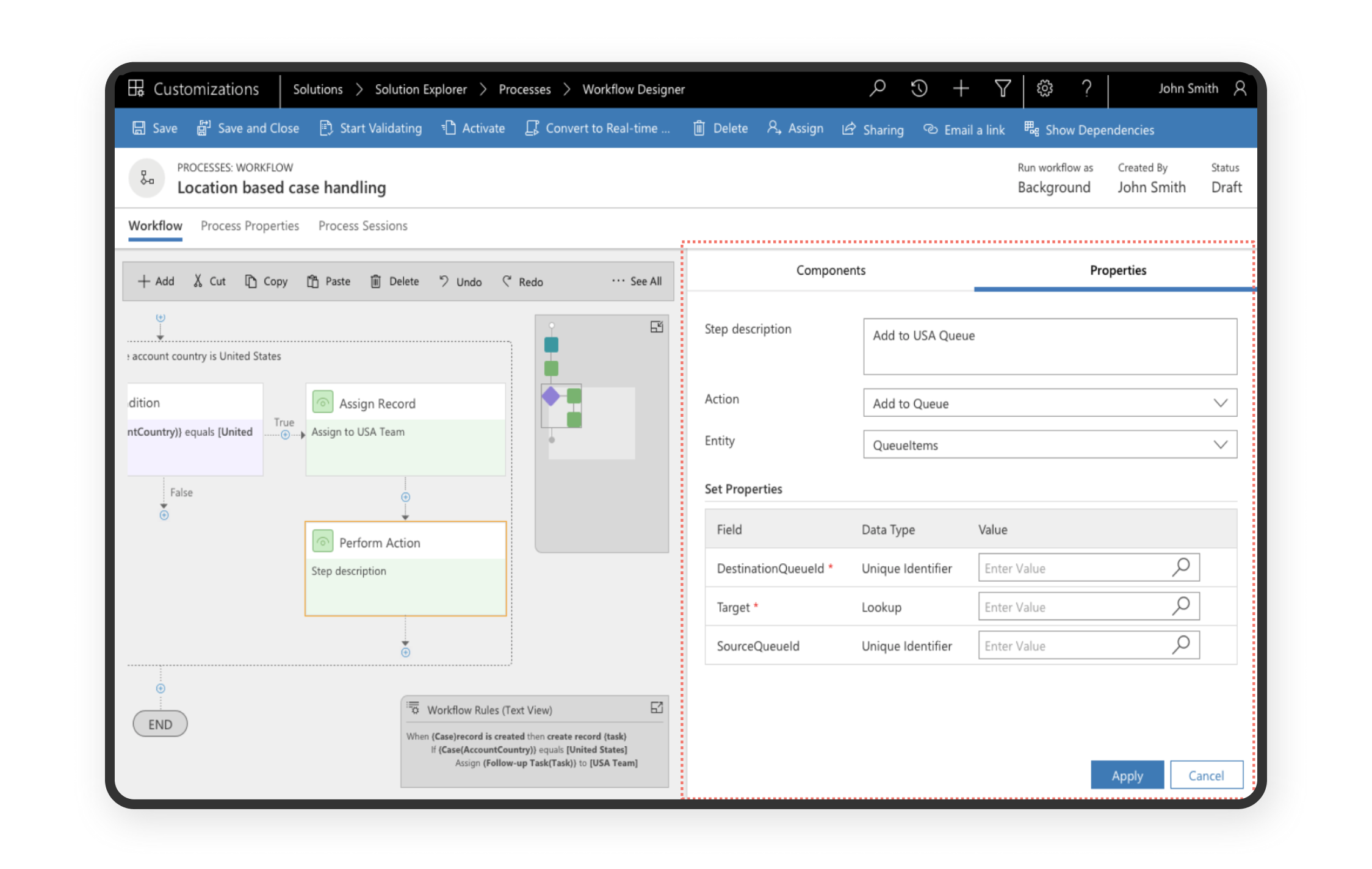
The Solution:
Once the user drops/adds a tile to the canvas, the components tab switches to properties tab. The user can configure or edit the selected tile from the properties pane. The properties pane took up till 50% of the screen width. This helps in maintaining the context of which tile he/she is actively editing.
4. Increasing Workable Space For Smaller Screens
The Challenge:
How to allow for more canvas/working space in smaller devices?

The Solution:
Full canvas view allows users to increase canvas area in the workflow designer by hiding the App header. The entire workflow designer was also designed to be responsive and the components resizes to the fit the window area.
Impact
We saw a definite improvement in the SUS (System Usability Scale) score in the Usability testing done with 10 participants.
.png)
The new designs were rolled out for MVPs (Most valuable professionals) first. We saw a very positive adoption from the group.
.png)
Learnings
When redesigning a complex product
- Understanding the entire eco-system is important - the users, business goals, and the technology and systems being used
- Maintaining parity with the older versions is important to avoid any data loss and user frustration.
- Effective communication within various teams
Collaborating with multiple PMs, dev leads and developers. - creating detailed hi-fi wireframes and weekly scrum calls are very useful to avoid miscommunication - Important that designers and developer do not work in silos. Designs are always evolving based on user testing feedbacks or development constraints. It is best to involve the dev team as soon as possible to understand constraints and come up with alternative solutions.