Flight Booking Experience
Lead UX efforts to launch the Flipkart Travel category from grounds up for mobile & web platforms.
OVERVIEW
The project aim was to design end-to-end flight booking & post-booking experiences for mobile and web channels for Flipkart users.
MY ROLE & DURATION
Product Designer II
Team: 1 Designer, 2 PM
Feb 2019 - June 2019
The Challenge
The Global travel industry (flights, buses, trains, and hotels) is valued at USD 1.5 Trillion (2018). Out of which, USD 650 Billion is booked online. The Airline industry is the most penetrated online, with the global average set to around 65%, and Indian penetration is close behind at 60%. The Indian airline industry is witnessing urgent growth, with Domestic travel growing by 20-25% and International by 10-12%.
In 2018, Flipkart started offering flight bookings to its users via Make my trip, a 3P service provider. In 2019, Flipkart decided to expand its offerings to the Travel category, starting with its own Flights bookings on web & mobile channels.
My Role
I was the only Product designer working with 2 PMs on the flight booking and post bookings flow for the mobile & web channels. I was involved from the starting of the project throughout the execution and launch of the mobile experience.
After the Flights category launch, I worked on optimising the booking funnel and improving the post-booking flows.
As part of the project, I also designed email templates for various booking status communication.
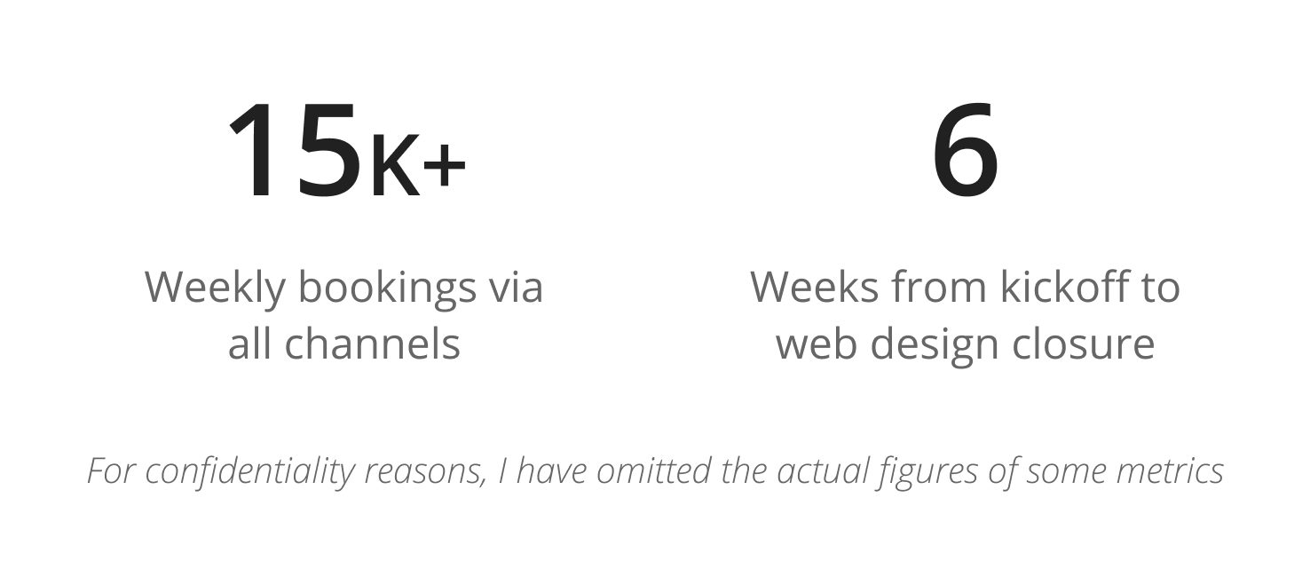
Project Timeline
Due to business urgency, the timelines for this project were quite tight.
I was able to get the design closure for the Web experience within 6 weeks, followed by the Email template design closure in the next 2 weeks. The design timeline for the mobile experience was comparatively relaxed and was completed within 10 weeks.
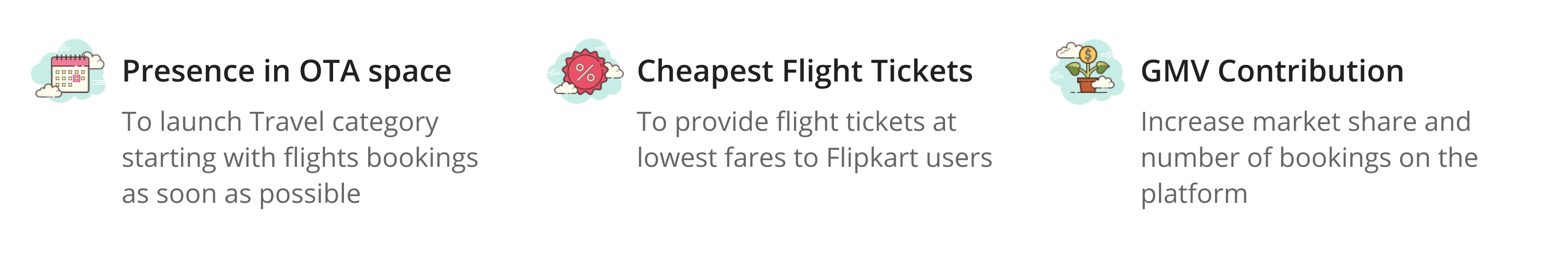
Business Goals
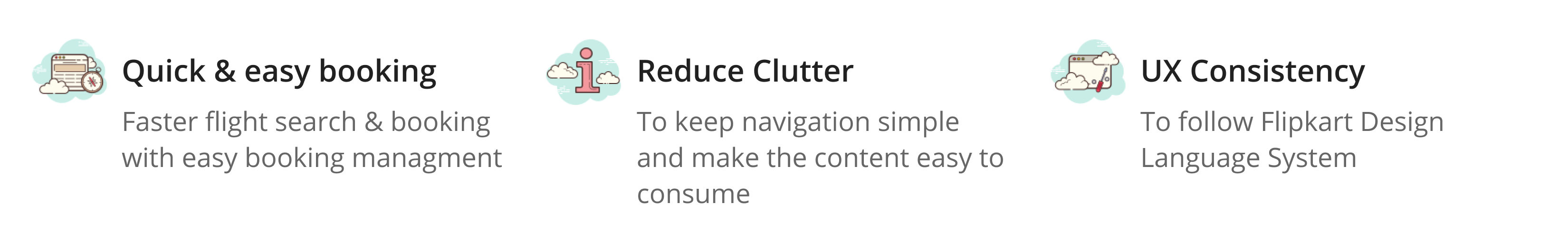
Design Goals
Constraints
- To meet the tight timelines and for faster execution, Flipkart partnered with Ixigo (another OTA) to use their back-end stack & CX systems to power bookings
- Tight timelines due to business urgency
- UX research team’s bandwidth unavailability
Understanding Users
The methodology used to understand users: Competitor analysis and User surveys.
I carried out Competitor analysis for Web & Mobile channels to understand the top OTA players’ best practices.
I also prepared a quantitative research questionnaire with the help of a UX researcher in the team and shared it with Flipkart users to find out what they look for while booking flight tickets online.
.png)
Most Users want to book a flight that has:
- The best price
- For an optimised date and time
- With the least stops and/or short layovers
- With the best airlines at accessible prices
- Know of extra services offered (if any)
e.g., info regarding in-flight meal or check-in baggage availability
While looking for the right flight, they also want to easily:
- Modify search from the results page to check alternate pricing/ flight options
- Apply additional discount coupons
- Connect to Customer support in case of an issue
Booking Experience
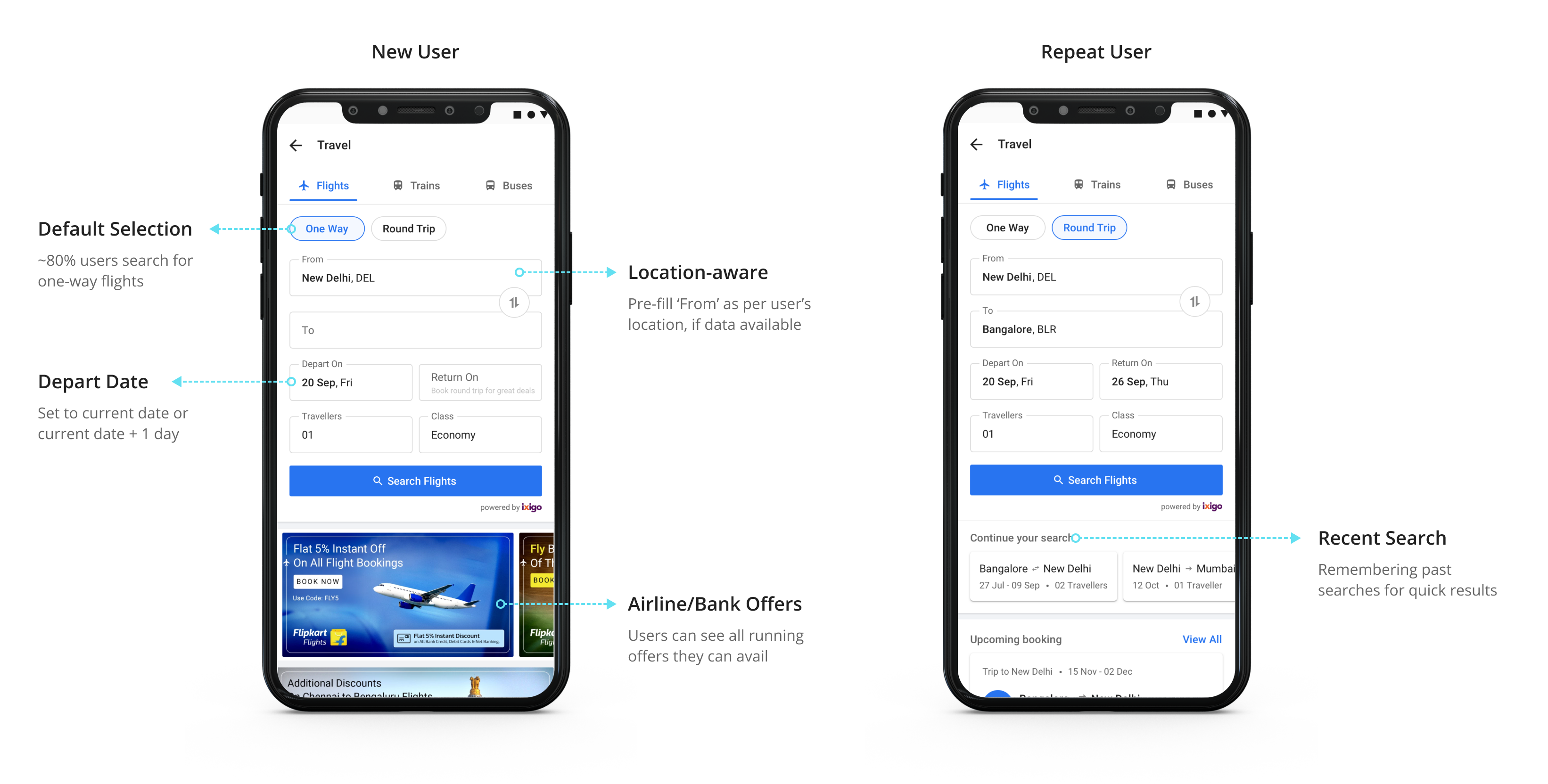
1. Travel Category Page
This page helps users get to the search results page or view top deals and offers.
.png)
We created a personalised page to quickly search for a new flight query or continue with their previous searches. I took the decisions after considering user trends from past Flipkart-MMT data.
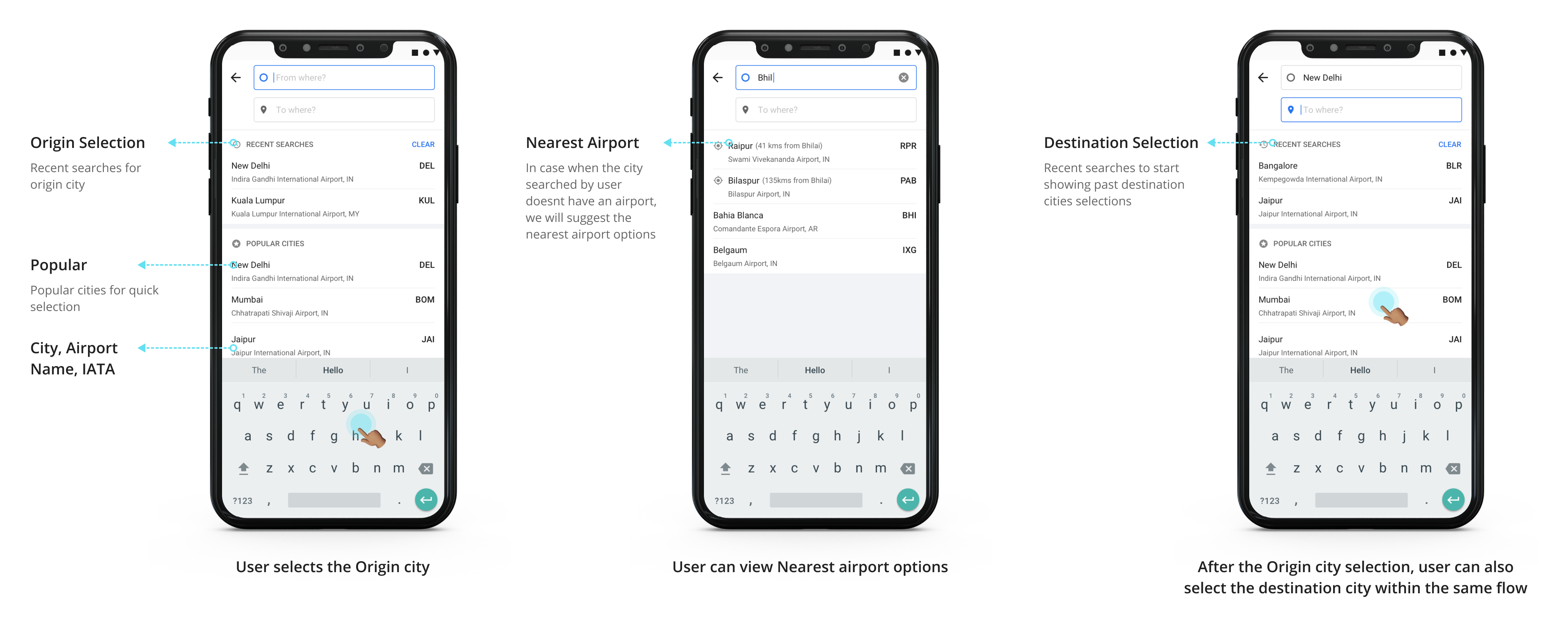
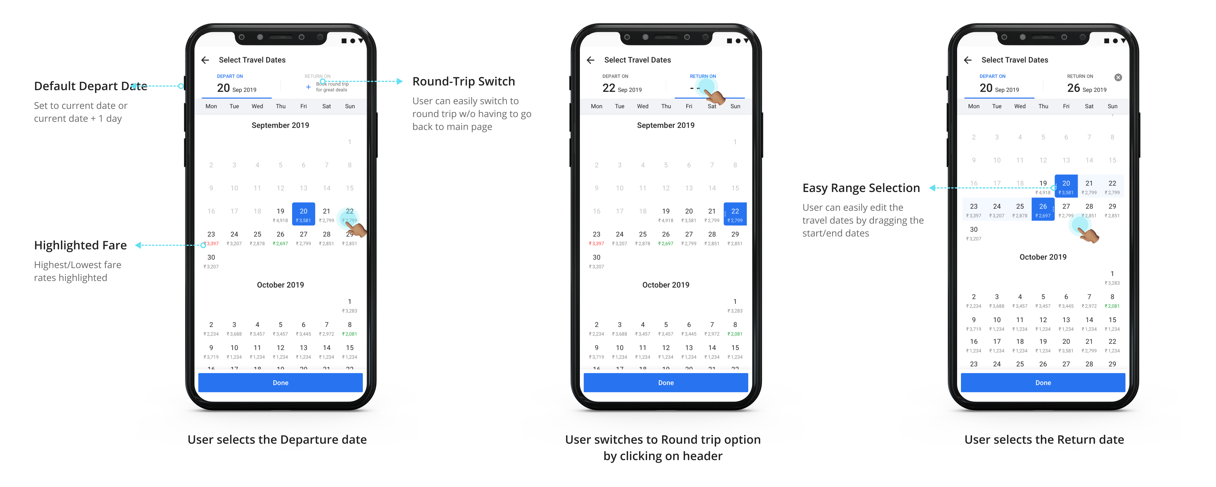
2. Selecting Origin & Destination Cities for Mobile experience
Filing the form on web experience is relatively straight-forward. One has to select from the dropdown options simply.
But filling the search form on a mobile device could a bit cumbersome. I clubbed the following fields together into single-screen flows to simplify and reduce hops from the main page:
- From & To fields
- Depart On & Return On
3. Decluttering Search Results
I worked out multiple iterations to make the listings clean and self-explanatory so that it is easier to compare and select the right option and move ahead. I also had to keep in mind the business goals like the possibility to show ads in-between results.
The iterations varied in terms of:
- Amount of white space
- The information displayed in the cards
- Information hierarchy that could aid faster information consumption
When a user searches for Indian Domestic flights, the Global Distribution System (GDS) by parter agency serves options for the Departing & Return flights separately for selection. Whereas in the case of international flights, the flight options are bundled and served.
This difference meant 2 different layouts for the Domestic & International Search Results Page.
I designed the domestic search result page to have 2 column layout, whereas the international search result page has 1 column layout.
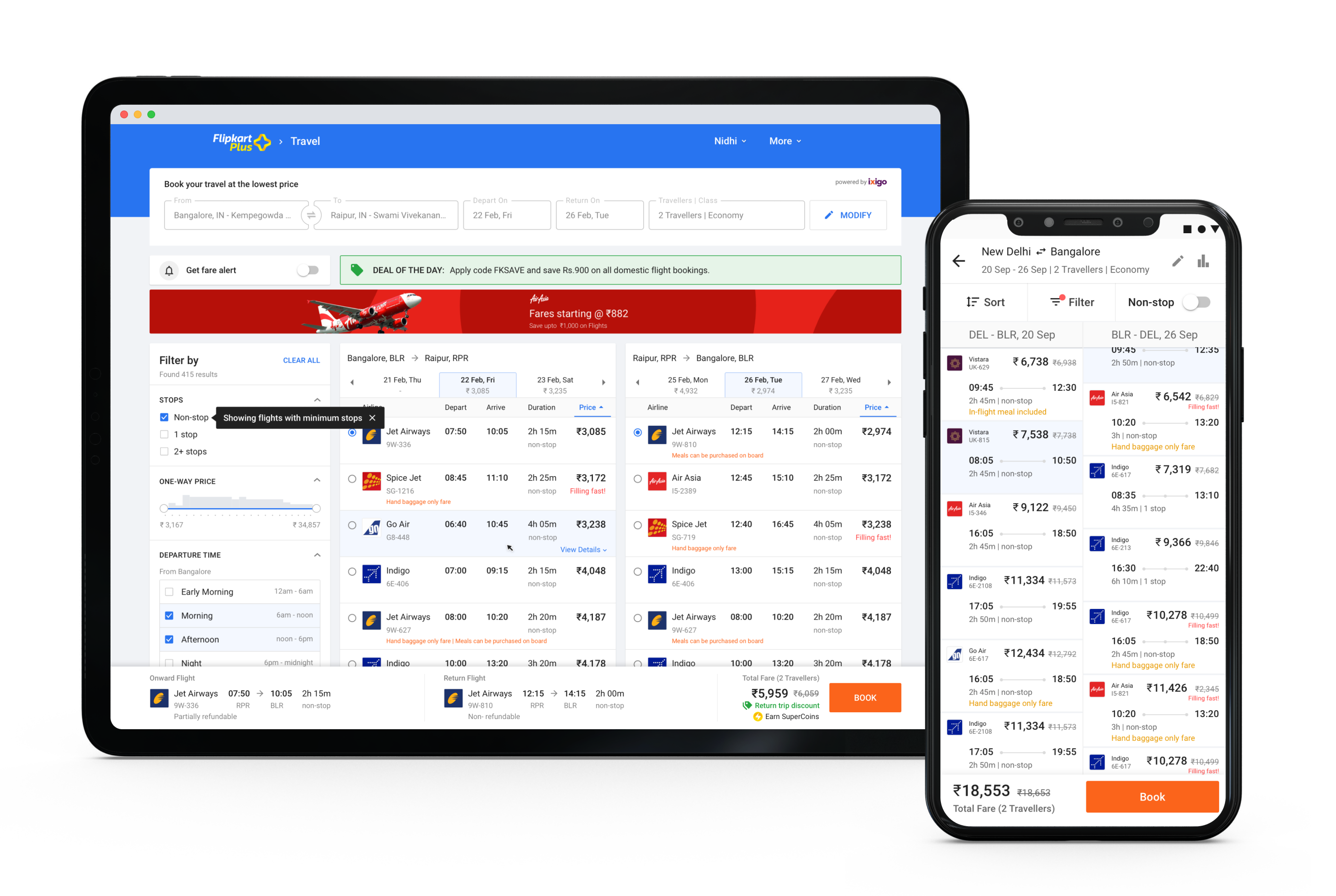
I designed the search cards for international flights to clearly show layover time and indicate the difference in days to accommodate the time difference.
I also indicated the layover duration visually for the mobile channel design to help with easy information consumption.

Web Experience:
To fully utilise the real estate in the web platform, the flight card was made expandable On Hover to show more details.
.png)
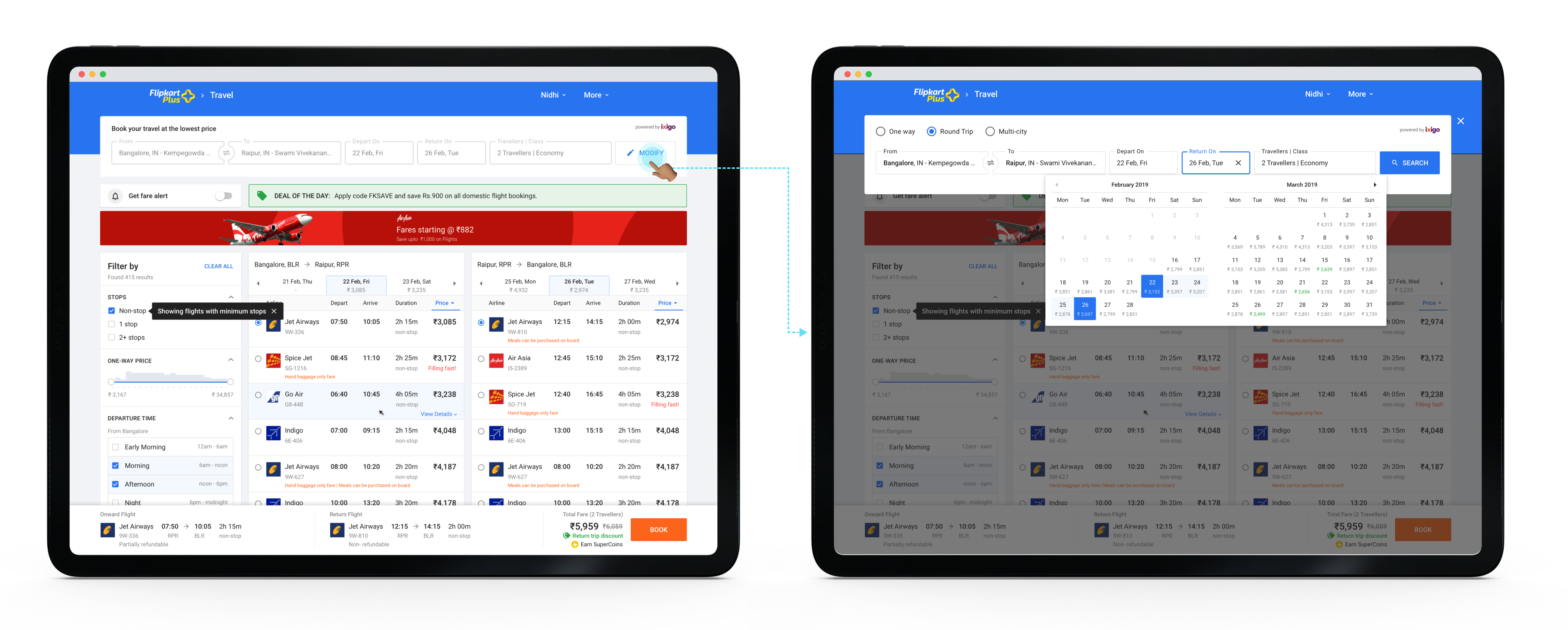
4. Modifying the Search
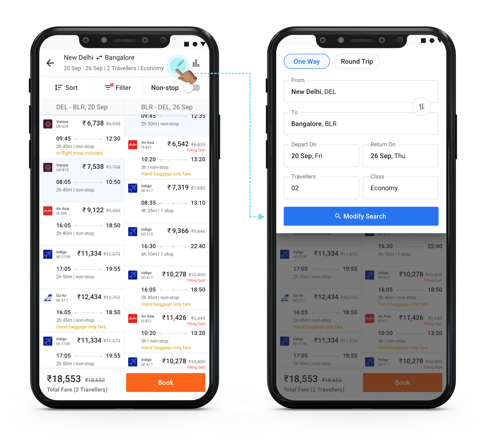
I learned from the initial research that sometimes users look for alternate travel date options or, in some cases, are considering different cities as their next holiday destination. They often have to return to the main page to change the search query.
I designed the search result page so that it is easy to modify/edit the option to change the location, date, and add or remove travelers.
5. Reviewing the Selected Flights & Filling the Traveller Information
This is an essential step before the final payment step. Once the user reaches this page, there is also a limited time for the user to complete the booking.
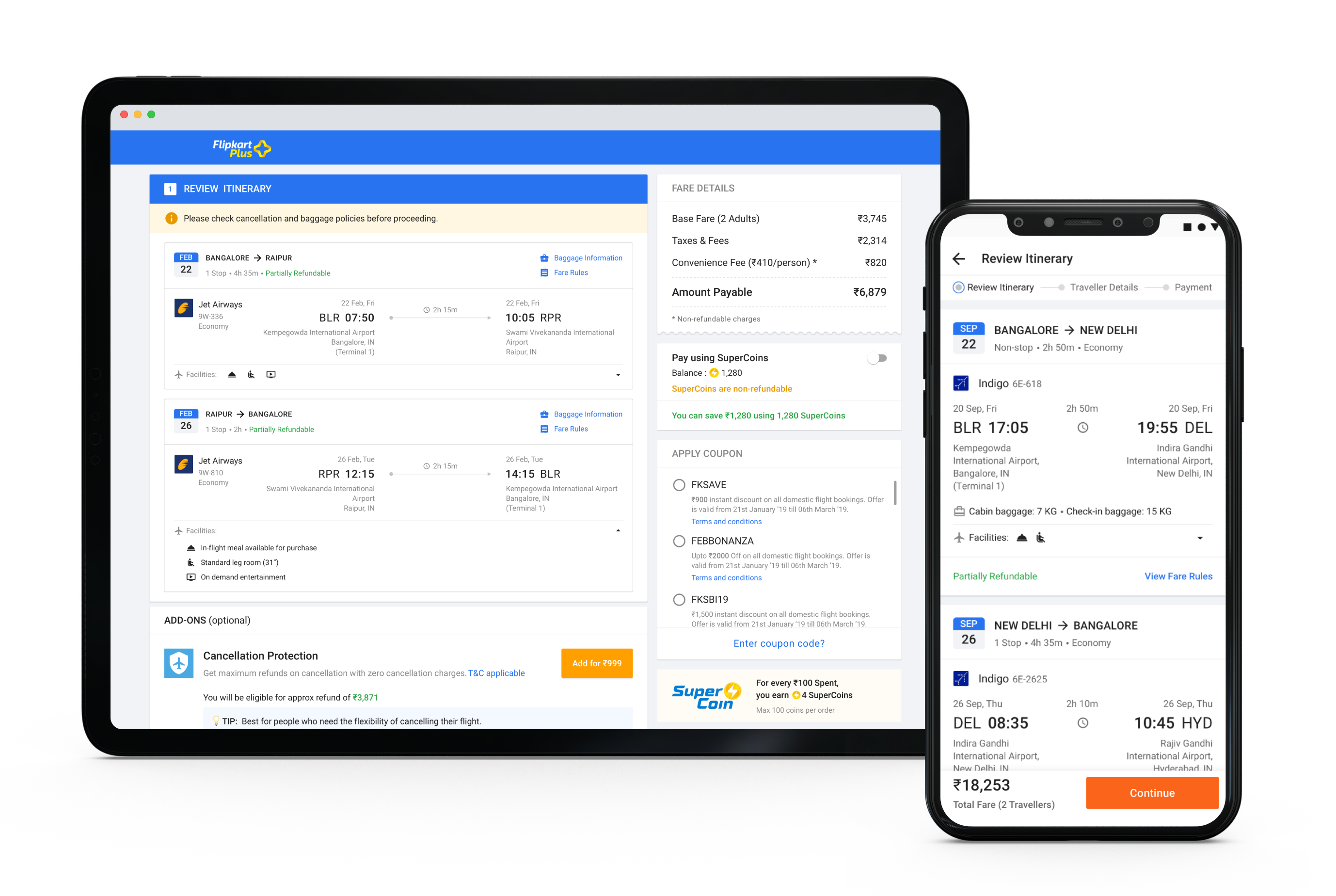
Mobile Experience:
.png)
Due to limited real-estate in the mobile platform, the flows were spread across 3 screens with a progress indicator just below the header.
Step 1 - Review flight, opt for add-on services, apply SuperCoin and discount coupon
.png)
Step 2 - Select from frequent travellers list or add new traveller details, Enter Primary contact detail where the e-ticket will be sent and GST details
.png)
Step 3 - Complete Payment
Web Experience:
I designed the review, traveler info, and payment steps in an accordion style. Users can complete all 3 steps in a go within a single screen and see the number of steps to be completed to place the booking.
This screen is also in alignment with the already existing Flipkart pre-payment flow and layout for other categories.

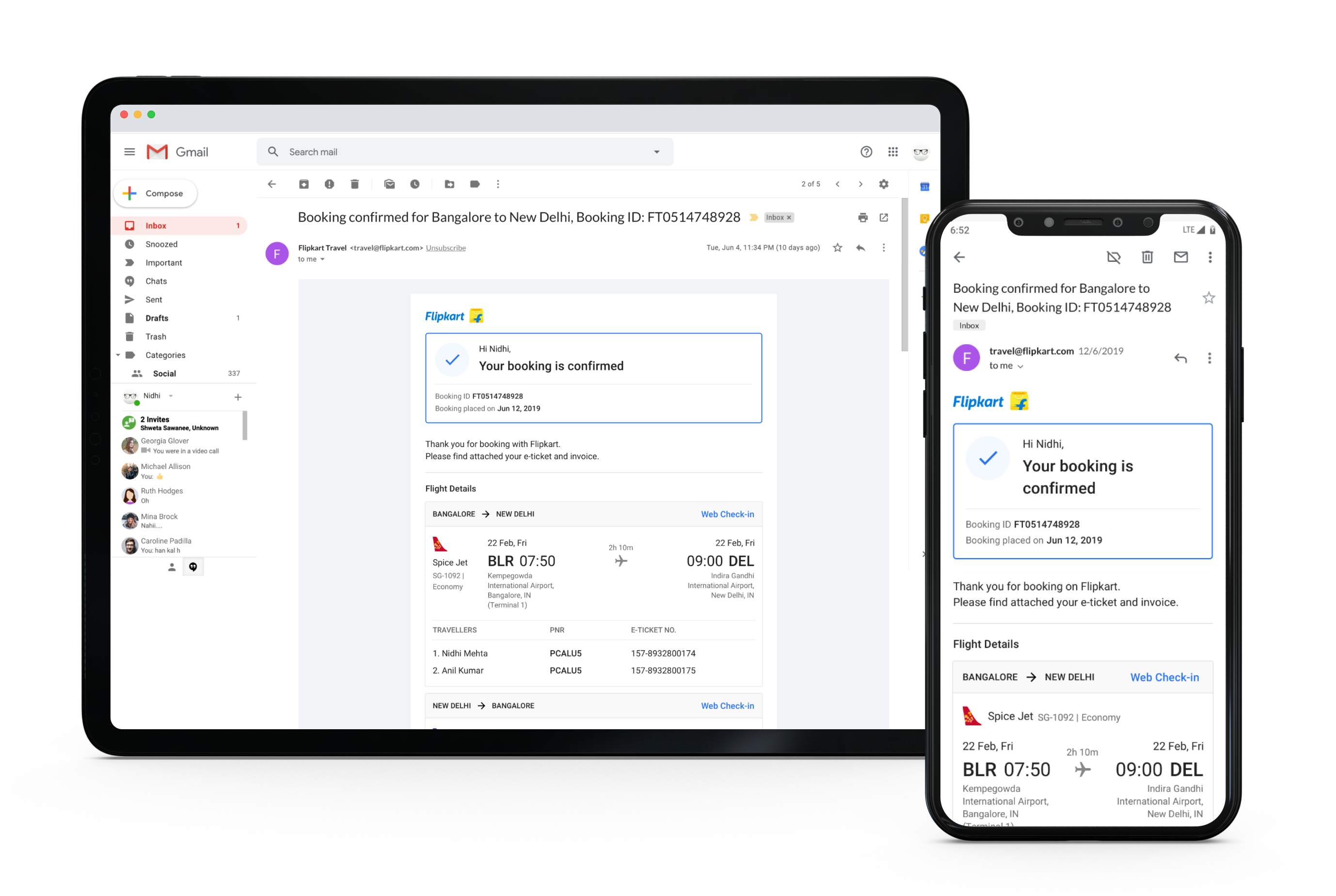
6. Payment Completion
Once the user makes the payment, the Flipkart servers connect with the GDS to confirm the payment and block the user’s seats.
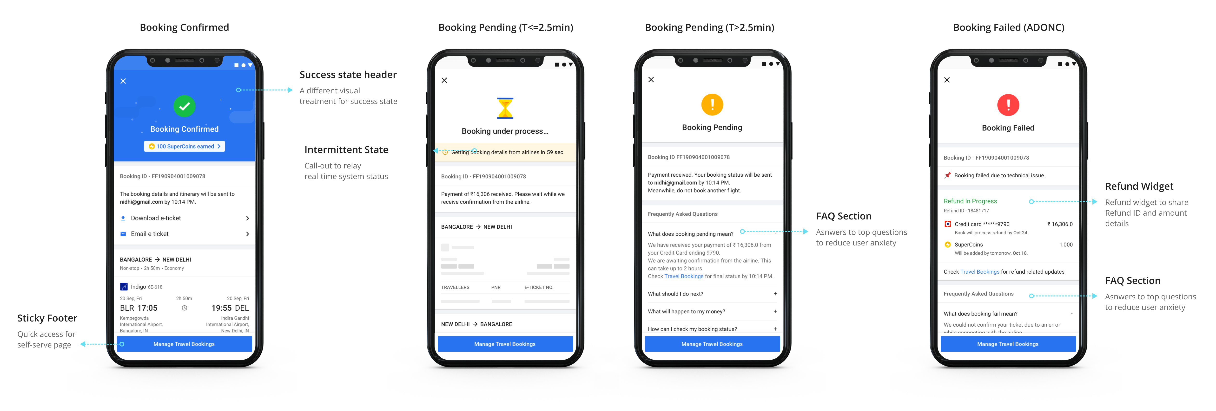
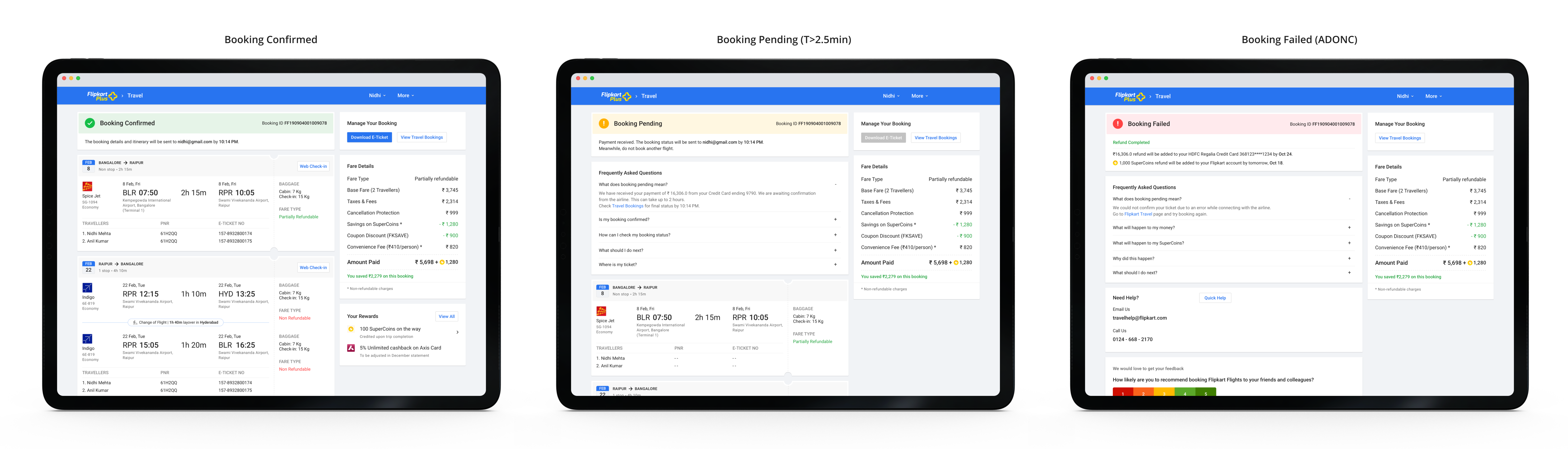
During this process, there could be the following scenarios:
- Booking successful - When all goes through without any glitches
- Booking Pending - When there is a communication delay either from Ixigo or Airline services
- Booking Failed - When either the payment fails (ADONC; Amount deducted but order not confirmed) or any other issue from Ixigo or Airline services.
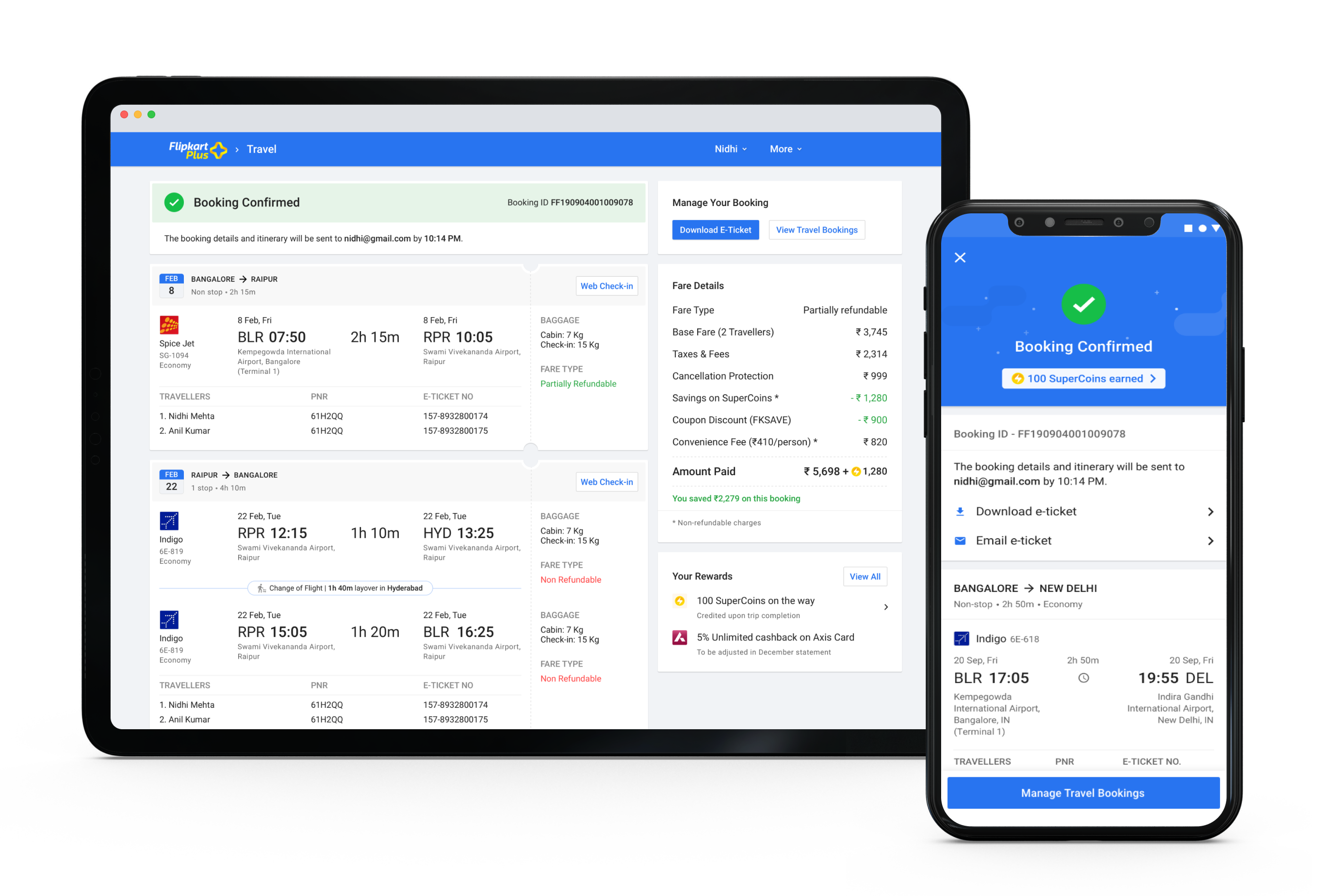
In case of error scenarios of booking pending or failure, it was crucial to have clear communication to reduce user anxiety and build trust.
I also designed the post-booking flows that cover self-serve flows like managing booking, changing travel dates, booking cancellations, modifying travellers, etc. For the scope of this case study, I will not cover the post-booking use-cases in detail.
Designing Responsive Email Templates
As part of designing the entire category experience, I created the email templates to communicate with the users for the following use-cases.
- Booking Status - Booking Confirmed, Booking Pending, Booking Failed
- Reschedule request
- Booking cancellation request
- Generic CX communication template
- NPS/RR emails
- Partner offer email
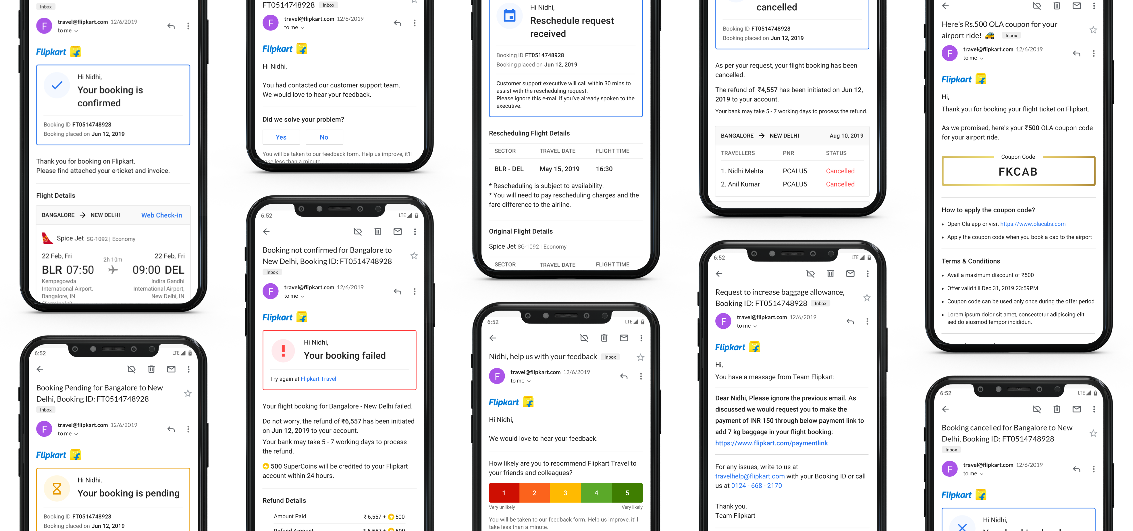
All email templates were designed with a mobile-first approach and were responsive. I designed the reflow behaviour.
I worked with the UX writer to close on crisp and clear communication that works for each use-case. I also coordinated with the legal and CX team to get their feedback regarding the communication before closing the designs. I then worked closely with the team executing the HTML implementation to ensure quality and responsiveness for all emailers.
.png)
Outcome
The mobile experience was launched in August 2019, followed by M-site & Web experience launch in March 2020.
Learnings
This was my 1st time working on an E2E product experience for a B2C product. Summing up my learnings from this project:
- Building for web & mobile channels
I had to reimagine the same user flows that need different approaches because of the difference in browsing behavior over a web vs. mobile platform.
- Stronger visual design skills
The iterative process leads to better and refined visual design outcomes.
- Working in an Agile team
The timeline for this entire project was quite tight. There were a few scope changes due to business strategy changes. I learned how to work within an agile team effectively and that communication is the key to keep all the stakeholders aligned and on the same page all the time. - Working within a cross-functional team
Launching a category from grounds-up is a mammoth task and requires different teams to come together. I interacted with other teams to align and get their buy-ins from various stakeholders from the Business team, Product Managers, Project managers, Team in charge of the Customer support training, PMs from Flipkart’s Post-purchase org, Legal team, etc.